Prepress Guides
Technical guides on colour separation, artwork preparation, and screen printing prepress - written from 13+ years of production experience.
 Featured
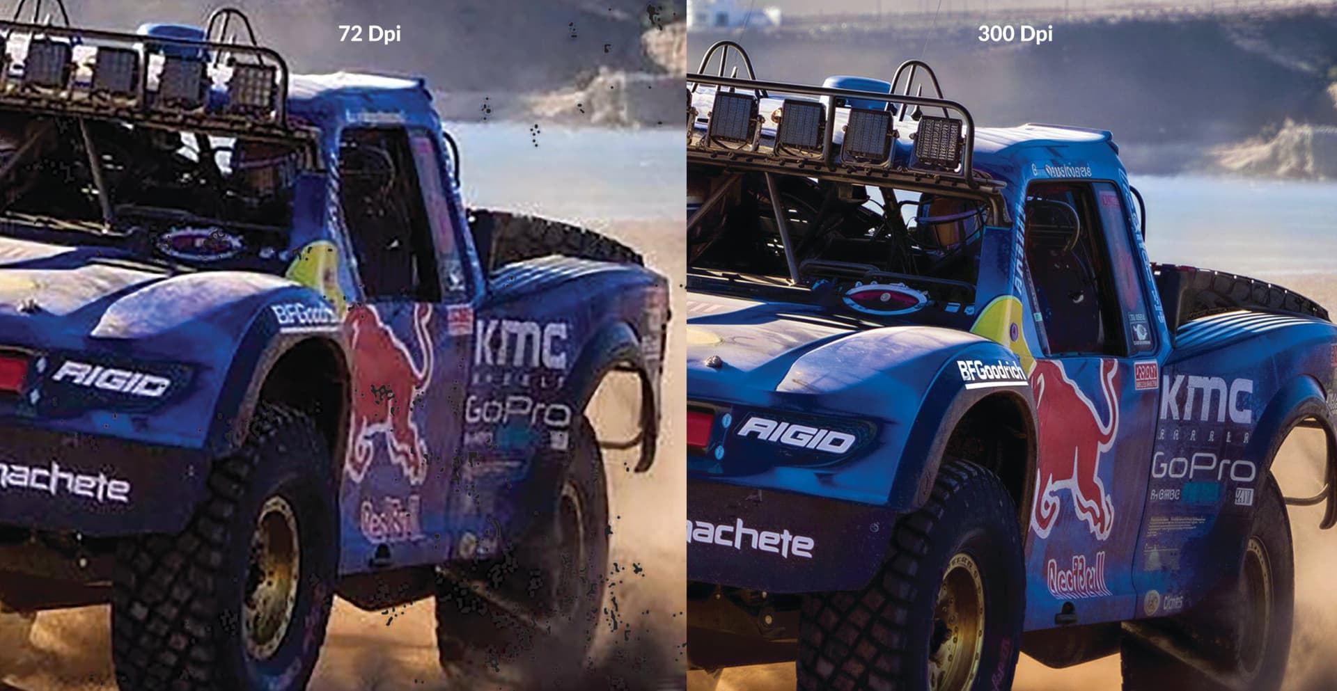
What Resolution Do You Need for Colour Separation?
DPI confusion causes more rejected artwork than almost anything else in prepress. Here is a clear breakdown of what resolution means for colour separation, and exactly what to send.
Underbase White in Screen Printing: When Do You Need It and How Much?
Designs that look bright on screen go dull and muddy on dark shirts. An underbase white is almost always the fix. Here is when you need one, how heavy it should be, and how we handle it in separation.
Why Does My Design Look Blurry When Printed? (And How to Fix It)
If your design looks great on screen but comes out fuzzy, jagged or pixelated in print, the file itself is usually the problem. Here's why it happens and how artwork rebuild fixes it.
Can a Low-Resolution or Damaged Logo Be Fixed for Printing?
Blurry, pixelated, or damaged logo files can usually be rebuilt into clean, print-ready artwork. Here is what can be recovered, what cannot, and how to get the best result.
Simulated Process vs Spot Colour: Which Separation Do You Need?
The two most common colour separation requests — and how to know which one is right for your artwork before you send it to press.